How did you use media technologies in the construction, research, planning and evaluation stages?
Wednesday, 6 May 2015
Tuesday, 5 May 2015
Monday, 4 May 2015
Evaluation Question: 2
How effective is the combination of your main product and ancillary texts?
Main Product
Ancillary Texts

Ancillary Texts

Sunday, 3 May 2015
Delirium: Key Shots
These are 5 key shots that I have found to be the most iconic in the film trailer that our group has produced. Each shot was carefully thought out in planning, allowing us to ensure that the representation, even down to the colours presented, hinted the horrific nature of the film, establishing the genre clearly and hopefully enticing the audience to watch the film, which generates profit for the filmmakers.
The first clip is the glimpse of the possession taking over the mother character. This disrupts the pace of the trailer as the tension is increased to encourage the audience to anticipate a scare, and the possession shot is specifically short to incorporate the dual personalities inside the character battling each other for control. It also creates an element of enigma as the shot is gone in the blink of an eye and leaves the audience wondering whether they just saw it. This plays of the assumption of society that ghosts and spirits are not real, and by using this sequence of shots, it urges the audience to question the possibility of spirits lingering, making the threat very real and the horror very effective.

The photo frame was selected to suggest the happy life the family presented had. The past tense is suggested through it being a photo and the suggestion that this happiness has ended is hinted through the blood smearing hand. The blood represents murder with the red symbolising the danger the family is in. The hand is purposely made to appear as disturbing as possible.
The dark bruises and cuts, with the jagged edges suggest the person is no stranger to pain. The nails in specific imply the origins of this character, as the sharp, black jagged nails are often associated with witch-like figures, portraying their cunning cruel nature. The hand shape itself is meant to resemble a female's hand, hinting more to the identity of the character.
This shot was also the inspiration for my poster image.

This shot represents the spirit taking control of the mother's body, as even the most basic routines of being alive, like sleeping, is disrupted by the spirit. The character even breaks the fourth wall by staring into the camera, and creating a simulation of eye contact with the audience member. However, rather than appear menacing or frightening in her expression, which the circumstances would suggest, the character appears scared herself. This portrays the last essence of the mother character breaking through sheer power of expressing the fear of the spirit. This, in turn, suggests strongly to the audience that is spirit is to be feared and to expect all manner of torment, causing the audience to perhaps feel protective for the character at risk.

The intention of this sequence of shots was to convey the impulsive and non-merciful obsession of the spirit. The non-relenting scratching of the floor where the vase smashed and the spirit was released could portray this almost insanity of the ghost and how she does not give up. The editing of the quick pace of short shorts helped convey this insanity, as the lack of order and the fast pace allowed the audience to almost be in the frenzy with her, which creates a bigger impact on her as they realize the danger of the spirit more.

The shots of the boy in the corner of the barn is placed at the end of the trailer to be the last thing the audience will view of the film in the trailer. After the gradually increase of pace and horror in the previous shots and the break of the title, we felt it would be effective to show the boy isolated to re-inforce his vulnerability in the house now. The setting was to connect to the release of the spirit, and imply the person walking towards the boy from the viewpoint of the camera could relate to the mother. To emphasize how the audience should fear for the boy, a high-angled shot was used portray her power and control over the son and how he is at the spirits mercy. The viewpoint of the mother allows the audience to experience the plot for the first time through the spirit's eyes, which emphasizes the danger the son is in and how the audience is powerless to help. All of this makes the trailer more memorable for the audience, and they may be then more inclined to go and view the film when it would of been released.

Saturday, 2 May 2015
Delirium Trailer: Focus Group Feedback
This is the audience feedback our group obtained when gathering together a focus group which we asked opinions on our trailer and other promotional pieces, such as our film posters and film magazines covers.
The Discussion:
We also gave them a questionnaire to fill out which includes open and multi-choice questions. This will give us a set of qualitative and quantitative results which we can use to improve and evaluate our product.
Here is a positive example of our questionnaire responses:
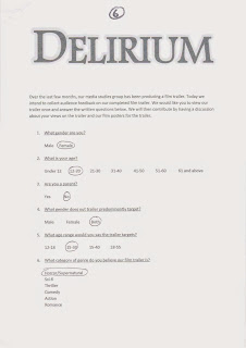

The results were as follows:
Word Association of Delirium:

The Viewing:
The Discussion:
Here is a positive example of our questionnaire responses:


The results were as follows:
Word Association of Delirium:

Evaluation Question: 1 - Film Magazine Cover
In what ways does your media product use, develop or challenge forms and conventions of real media products?
Film Magazine Cover
Friday, 1 May 2015
Evaluation Question: 1 - Film Poster
In what ways does your media product use, develop or challenge forms and conventions of real media products?
Film Poster
Wednesday, 29 April 2015
Evaluation Question: 1 - Film Trailer
In what ways does your media product use, develop or challenge forms and conventions of real media products?
Film Trailer

Friday, 24 April 2015
Finished InDesign Film Magazine
This is my completed InDesign horror issue cover of a film magazine I have named 'FLICKS'. It is one of the three pieces I have created to promote our group's trailer 'DELIRIUM'. These three pieces would be our film trailer, my film poster and my film magazine.
The only additional editing I have made since my last draft are various tweaks to it's detail, such as ensuring the splash is clear and shortening the slashes at the bottom of the page to to make certain nothing is on the fade, which would ruin the effect and present the magazine cover as unprofessional and unrealistic.
 Full Analysis:
The Masthead
For the magazine brand, I chose to use 'FLICKS' as it refers to cinemas, where films are premiered.
The Magazine's Tagline
I felt that the word 'BIGGEST' did not give the magazine's tagline the professional portrayal that would associate this magazine with success. Therefore I altered the word to 'LEADING', expressing how this magazine is ahead of any other.
The Main Image
The representation behind the mother character presented is to intrigue the audience as it is against stereotypes for a female mother-figure to be portrayed as the villain. This may help to stay in the audience's memory and therefore fulfill the purpose of the magazine cover, as a promotional device for the film to attract an audience for the film. The eyes are specifically the only aspect left blue, as a contrast to the red apparent on and around the character. This enhances the eyes and relates to an intertitle of the trailer 'The eyes are the window to the soul'. The blue can also have the connotation of ghosts and the supernatural. Both points help to convey the woman's possession by the evil spirit.
I wanted to portray her with dirt and more bruises to show the physical impact of the possession, as well as relating to bruised shots of her in the trailer of the film.
The object of the scissors is used as a prop in the image to relate to the murder weapon hinted in the trailer. Additionally with it being used to shush the audience, gives the character an unsettling yet memorable quality.I also edited blood dripping down the scissors as I felt the danger of her character wasn't portrayed as well as I had hoped. By adding the blood, it suggests to the audience that the scissors is a murder weapon and it portrays the true extent the character will go to in order to enact her revenge.
The Sell Lines
I changed the sell lines to contain information that is current and horror themed. This information was learnt from research I undertook to know information like which horror films were coming out soon after 'OCT 2015', which is the release date of our groups's horror film trailer. This creates a sense of realism of my magazine and presents it more as a professional media product. I used the colour scheme of red black and white to emphasize certain words within my sell likes like PREMIERE is shown to do.
The Quotation
The quotation of a review was added to perhaps influence the audience's first impressions of the film before they have viewed it, and encourage them to view it.
The Splash
I also used the same font and style of title used in my poster and our group's trailer to link it to the film more effectively. The title is also the one of the largest texts on the page, alongside the masthead. This is to emphasize it's importance in the issue as the main feature.
The Splash's Tagline
I changed the text underneath the splash, still using selling language like 'EXCLUSIVE' but instead involving the actress more and detailing a little about the feature. I also included language that related to the horror genre 'hair-raising', which reinforced the horror theme of the issue.
The Footer Text
Feedback on my poster was that the bottom section under the splash 'looks bare', so I researched other issues of film magazines and adapted the style of EMPIRE.
The Colour Scheme
The colour scheme was chosen specifically to relate to genre of film the issue was focusing on (horror), with connotations such as black representing death and evil, and red portraying danger and blood.
Conventional Details
The only additional editing I have made since my last draft are various tweaks to it's detail, such as ensuring the splash is clear and shortening the slashes at the bottom of the page to to make certain nothing is on the fade, which would ruin the effect and present the magazine cover as unprofessional and unrealistic.

The Masthead
For the magazine brand, I chose to use 'FLICKS' as it refers to cinemas, where films are premiered.
The Magazine's Tagline
I felt that the word 'BIGGEST' did not give the magazine's tagline the professional portrayal that would associate this magazine with success. Therefore I altered the word to 'LEADING', expressing how this magazine is ahead of any other.
The Main Image
The representation behind the mother character presented is to intrigue the audience as it is against stereotypes for a female mother-figure to be portrayed as the villain. This may help to stay in the audience's memory and therefore fulfill the purpose of the magazine cover, as a promotional device for the film to attract an audience for the film. The eyes are specifically the only aspect left blue, as a contrast to the red apparent on and around the character. This enhances the eyes and relates to an intertitle of the trailer 'The eyes are the window to the soul'. The blue can also have the connotation of ghosts and the supernatural. Both points help to convey the woman's possession by the evil spirit.
I wanted to portray her with dirt and more bruises to show the physical impact of the possession, as well as relating to bruised shots of her in the trailer of the film.
The object of the scissors is used as a prop in the image to relate to the murder weapon hinted in the trailer. Additionally with it being used to shush the audience, gives the character an unsettling yet memorable quality.I also edited blood dripping down the scissors as I felt the danger of her character wasn't portrayed as well as I had hoped. By adding the blood, it suggests to the audience that the scissors is a murder weapon and it portrays the true extent the character will go to in order to enact her revenge.
The Sell Lines
I changed the sell lines to contain information that is current and horror themed. This information was learnt from research I undertook to know information like which horror films were coming out soon after 'OCT 2015', which is the release date of our groups's horror film trailer. This creates a sense of realism of my magazine and presents it more as a professional media product. I used the colour scheme of red black and white to emphasize certain words within my sell likes like PREMIERE is shown to do.
The Quotation
The quotation of a review was added to perhaps influence the audience's first impressions of the film before they have viewed it, and encourage them to view it.
The Splash
I also used the same font and style of title used in my poster and our group's trailer to link it to the film more effectively. The title is also the one of the largest texts on the page, alongside the masthead. This is to emphasize it's importance in the issue as the main feature.
The Splash's Tagline
I changed the text underneath the splash, still using selling language like 'EXCLUSIVE' but instead involving the actress more and detailing a little about the feature. I also included language that related to the horror genre 'hair-raising', which reinforced the horror theme of the issue.
The Footer Text
Feedback on my poster was that the bottom section under the splash 'looks bare', so I researched other issues of film magazines and adapted the style of EMPIRE.
The Colour Scheme
The colour scheme was chosen specifically to relate to genre of film the issue was focusing on (horror), with connotations such as black representing death and evil, and red portraying danger and blood.
Conventional Details
The price shown on the cover is artificially inserted above a price tag so as to present the price I felt was appropriate for a film magazine. The price I settled on was £3.90 as the I had researched different brands of magazines and brands such as EMPIRE often vary their price from £3.70 to £3.99. Therefore I chose a price relatively in the middle of those that I have seen, yet slightly toward the higher end of the scale as my cover would be a halloween issue and therefore be one of the more special issues of the year.
I included various other conventional details, one of which would be the involvement of the brand's web address 'www.flicks.com'. As a modern magazine brand, the technophilic society we live in engages with many different media forms throughout their day, and so it is realistic for my magazine to mimic the strategy of presenting different media platforms of their brands. This means that their product is more accessible to a wider audience and target the younger audiences more effectively, as they are most commonly noted as being technophiles.
Saturday, 18 April 2015
InDesign Film Magazine Draft: 3
In this stage of my progress, I mainly focused on my image. I wanted to portray her with dirt and more bruises to show the physical impact of the possession, as well as relating to bruised shots of her in the trailer of the film. Therefore I darkened patches of her skin and top, and used Adobe Photoshop to show bruises on her body, altering and fading them to blend into her skin.

I also edited blood dripping down the scissors as I felt the danger of her character wasn't portrayed as well as I had hoped. By adding the blood, it suggests to the audience that the scissors is a murder weapon and it portrays the true extent the character will go to in order to enact her revenge.
Tuesday, 14 April 2015
InDesign Film Magazine Draft: 2
This is when I have added my main image onto my cover page. I used InDesign feathering tools to slightly fade the outline of the image so as the model blends with the cover more, but also appears slightly ghosty, relating to the possession she experiences in the plot of the film.

I felt that the word 'BIGGEST' did not give the magazine's tagline the professional portrayal that would associate this magazine with success. Therefore I altered the word to 'LEADING', expressing how this magazine is ahead of any other.
Her hair extends behind the masthead which was an intentional detail that I found evident in many issues of different brands such as EMPIRE and PREMIERE.


I also changed the slashes between the film names at the bottom of the page to red, which allowed the colour on the page to appear more evenly distributed.
In terms of the sell lines, I removed the sell line promoting Alfred Hitchcock content as it was too large and the image wouldn't of been able to have been shown well with the text making the page look cluttered. Therefore I decided to decrease the number of my sell lines and re-arrange the rest to a more spaced out layout, while still maintaining a structure. I found this to be effective in other issues of magazines.
As well as this, to give the magazine a darker ambience, I created a black background behind the grey one I had already made. I then made the grey box smaller and feathered it's edges. All this created a dark outerline that appears as if darkness is surrounding the issue, relating to the theme of horror.
Wednesday, 8 April 2015
InDesign Film Magazine Draft: 1
This is my first basic draft at creating my idea of a professional horror film magazine cover on InDesign.

However, unlike my drawn draft, so details of the magazine cover have been altered as I considered some of them not to have been effective in appealing to the audience.

Some of these changes was the movement of the header line of text across the top of the page, to instead be placed underneath the masthead. This helps lengthen the page and is evident in other professional magazines, such as EMPIRE.
I changed the sell lines to contain information that is current and horror themed. This information was learnt from research I undertook to know information like which horror films were coming out soon after 'OCT 2015', which is the release date of our groups's horror film trailer. This creates a sense of realism of my magazine and presents it more as a professional media product. I used the colour scheme of red black and white to emphasize certain words within my sell likes like PREMIERE is shown to do.Feedback on my poster was that the bottom section under the splash 'looks bare', so I researched other issues of film magazines and adapted the style of EMPIRE.
I also used the same font and style of title used in my poster and our group's trailer to link it to the film more effectively. The title is also the one of the largest texts on the page, alongside the masthead. This is to emphasize it's importance in the issue as the main feature.
The price shown on the cover is artificially inserted above a price tag so as to present the price I felt was appropriate for a film magazine. The price I settled on was £3.90 as the I had researched different brands of magazines and brands such as EMPIRE often vary their price from £3.70 to £3.99. Therefore I chose a price relatively in the middle of those that I have seen, yet slightly toward the higher end of the scale as my cover would be a halloween issue and therefore be one of the more special issues of the year.
I included various other conventional details, one of which would be the involvement of the brand's web address 'www.flicks.com'. As a modern magazine brand, the technophilic society we live in engages with many different media forms throughout their day, and so it is realistic for my magazine to mimic the strategy of presenting different media platforms of their brands. This means that their product is more accessible to a wider audience and target the younger audiences more effectively, as they are most commonly noted as being technophiles.
The quotation of a review was added to perhaps influence the audience's first impressions of the film before they have viewed it, and encourage them to view it.
I changed the text underneath the splash, still using selling language like 'EXCLUSIVE' but instead involving the actress more and detailing a little about the feature.
Saturday, 4 April 2015
Delirium Film Magazine Image
This is my progress in obtaining a suitable image for my film magazine cover. I wanted my image to be recognisable to the audience, and because the actress wouldn't be known to audience well, I decided to have the actress in character for the shoot. This also helps portray the horror theme of the issue.
I chose to use the weapon involved in some shots during the trailer of the film. Coupled with the extra mise-en-scene of the costume and make-up, portraying the possessed red eyes and the bruises, it presents this female with connotations of evil, which is a challenge of the typical old male villain conventions. This use of a murderous weapon helps contrast with the innocent and trance-like expression of the mother character, which hints her possessed state and creates an unnerving feeling for the audience. The use of the scissors shushing the audience is an action usually associated with children, suggesting their involvement in the film. It also creates the element of fear for the audience that they need to be quiet, possibly hiding from something or the character warning them not to scream.

I wanted to create a darker background behind the image, so I used Adobe Photoshop to remove the background so I manipulate the image to my own background.
.jpg)
However, I did use the editing tools on the Adobe Photoshop software to darken the image to present it as linking better to the horror theme. I also used the tools to make her eyes a more piercing blue, as it is the only blue to be involved on the cover page, to draw attention to her eyes. This relates to another intertitle in our trailer 'THE EYES ARE THE WINDOW TO THE SOUL', which relates to the possession involved in the plot. As this film magazine cover is another tool used to promote the film and it's trailer and the main promoter, I have tried to link the three pieces subtly when it is appropriate.
%2B4.jpg)
Thursday, 2 April 2015
Film Magazine Drawn Draft
This is my initial drawn drafter of my film magazine that I have created to aid the promotion of the trailer out group has created, 'DELIRIUM'.

The representation behind the mother character presented is to intrigue the audience as it is against stereotypes for a female mother-figure to be portrayed as the villain. This may help to stay in the audience's memory and therefore fulfill the purpose of the magazine cover, as a promotional device for the film to attract an audience for the film. The eyes are specifically the only aspect left blue, as a contrast to the red apparent on and around the character. This enhances the eyes and relates to an intertitle of the trailer 'The eyes are the window to the soul'. The blue can also have the connotation of ghosts and the supernatural. Both points help to convey the woman's possession by the evil spirit.
The object of the scissors is used as a prop in the image to relate to the murder weapon hinted in the trailer. Additionally with it being used to shush the audience, gives the character an unsettling yet memorable quality.
For the magazine brand, I chose to use 'FLICKS' as it refers to cinemas, where films are premiered. With this, I created fictional online information to present the magazine as realistic and professional, such as www.flicks.com, which is a conventional detail many magazine in general apply to keep up to date with the modern technophilic society.
This also true for the use of a barcode, price and issue date, which are all conventional details of magazines and present the cover as realistic.
The colour scheme was chosen specifically to relate to genre of film the issue was focusing on (horror), with connotations such as black representing death and evil, and red portraying danger and blood.
The film-related sell lines are kept as basic as possible, to present the cover as cluttered. Therefore, a strict grid structure is made to keep the cover looking professional, which is evident through other aspect of the cover such as a header and the splash, which is the trailer's name 'DELIRIUM', as it is one of the most crucial key pieces of information to remember.
The main inspiration for the structure of my film magazine came from the Premiere issue:

Wednesday, 1 April 2015
Delirium: Finished Film Trailer
This is the finished version of the horror trailer our group produced. We took many steps to ensure that it was completed to the best of our ability, which included drafting the trailer using a story board and then animatic. This helped us alter and improve our concept and vision visually.
This includes the soundtrack our group created to match our trailer effectively. It's beats are synchronised with the flow of shots, mainly in time with impacting shots. As the soundtrack builds, the tension the audience experiences increases, as our research proved a convention of many horror trailers. Urging the audience to feel tense contributes to the fear they should be experiencing for the child, and hopefully make a greater impact in the audience's memory, which is the aim of a promotional device like a trailer. This is because if the trailer remains in the audience's memory well, there is a good chance they may be intrigued to go and watch the film or tell other's about it.
This includes the soundtrack our group created to match our trailer effectively. It's beats are synchronised with the flow of shots, mainly in time with impacting shots. As the soundtrack builds, the tension the audience experiences increases, as our research proved a convention of many horror trailers. Urging the audience to feel tense contributes to the fear they should be experiencing for the child, and hopefully make a greater impact in the audience's memory, which is the aim of a promotional device like a trailer. This is because if the trailer remains in the audience's memory well, there is a good chance they may be intrigued to go and watch the film or tell other's about it.
Saturday, 28 March 2015
Finished InDesign Poster
This is my completed poster for our group's Delirium film trailer. The final adjustments I made were the changes to the billing block. From observing professional posters, I realised that the billing block was far too square, which meant that it took up half the poster and took focus away from the image, leaving blank space. Therefore I re-made the billing block so it would be more rectangular, and then I could enlarge and move the other content down the page, giving the main focus to the image and the title. This was important as posters are supposed to be image led, and the text should be minimal and basic with key information.

Full Analysis:
The Tagline
For the tagline, I eventually used a font similar to the title so as to link it better to the poster. However, I made sure to keep it smaller than the title so it did not distract from key information like the title and the release date, and there could be more focus on the image. The word 'PAST' relates to the image being a photo frame and connects the poster together more seamlessly. 'HAUNT' could suggest to the audience the supernatural presence of the possession in the plot. Also, 'YOU' directs the tag line to the individual audience member, helping the audience to feel more involved in the plot, possibly even feeling at risk of the danger, creating a more longer-standing memory. As a promotional device for the film, this is ideal as it counts on making an impression on the audience so that they feel intrigued enough to go and view the film and gain profit through ticket sales for the filmmaker.
The Background
I wanted the background to look as realistic as possible to present the film as of high quality and the fear to be more effective. Therefore, I searched different backgrounds to appear underneath the main image. I finally settled on the grey wall to portray the dark and mysterious nature of the plot and the villain, which also allows me to place key information on without the difficultly patterns would cause to reading.
The Main Image
The image of the photo frame was selected to suggest the happy life the family presented had. The past tense is suggested through it being a photo and the suggestion that this happiness has ended is hinted through the blood smearing hand. The blood represents murder with the red symbolising the danger the family is in. The hand is purposely made to appear as disturbing as possible.The dark bruises and cuts, with the jagged edges suggest the person is no stranger to pain. The nails in specific imply the origins of this character, as the sharp, black jagged nails are often associated with witch-like figures, portraying their cunning cruel nature. The hand shape itself is meant to resemble a female's hand, hinting more to the identity of the character.
When considering the position of the hand across the frame. The position of the fingers convey elements of the plot. The child is almost hidden between the index and middle figure, suggesting the figure's dominance over him, and how he is quite literally in her grasp. These fingers are the more used and so hint the figure's focus on the child. The other fingertips rest near the mother's face, implying how she is not as victim but involved. The idea behind this is that the nails are around her head, suggesting her link to the figure. Finally, the father figure is completely left. This is intentional as the character is left unaware and in the dark to the true nature and extent of the figure (the possessed mother) and even takes to videoing the disturbances to gain more knowledge. Him being left in the lighter side of the portrait against the darkness of the hand also portrays the battle between him as the saviour and the evil possessed mother over the safety of the child and themselves.
The Title
The title 'DELIRIUM' suggests the insanity of the possessed mother and her ambiguous true nature and origin which the audience will be intrigued to find out during the film. The size and position of the title is purposely done to emphasize the importance of the name of the film as key information, as it is vital to the audience finding out more about the film. The white outline of the text creates the eerie and mysterious ambience. That, with the similar faded outline of the main image
The Billing Block
By making my own billing block and adding it to the film poster, it helps to create the presentation of a professional and realistic film poster. I re-made the billing block so as to have a rectangular shape, which allowed me to create a more balanced and conventionally correct layout.
The Release Date
The release date is the second largest piece of text on the page, as it is key alongside the title as informing the audience when to go about watching the film. I made the colour a dark red to link to the blood in the picture better and to portray the dark nature of the film more effectively.
Conventional Details
The poster include three set of online information,such as a web address and two social media links. This helps the modern audience stay up to date and interested in the film by using the technophilic society we live in now to access a wider audience.
Wednesday, 25 March 2015
InDesign Poster Draft: 4
This draft shows the final change in my tagline. I felt that the tagline was too disconnected from the rest of the poster and so, to tie it in, I changed the font to the same as the title. However, I made sure the size was smaller than the title so as ensure the title maintained as being the most crucial information on the page to take note of.

I also darkened the colour of the release date. The original shade of red, I felt was too bright and by darkening it, the red connects to the dark red of the blood better and portrays the dark nature of the film more effectively.
Saturday, 21 March 2015
InDesign Poster Draft: 3

For my tagline, I then went on to place it on the frame of the photo, so as to link to the image better. I intentionally kept the text small and black as to not distract in from the title in size, or the release date in colour, as those are more important information for the audience to remember.
When considering the release date, I not only enlarged the text, but I also changed to the font to Impact to be more noticable on the page as key information.
I added in the billing block by converting the document to a png from Adobe Photoshop. This aided me by finishing adding all the content needed to complete the poster and leaving just arranging to be done.
Tuesday, 17 March 2015
InDesign Poster Draft: 2
Still deciding on the placement of the tagline, I meanwhile occupied myself with the creation of more blood on the poster as the props of lip stick to create fake blood did not give the image the frightening effect I had intended.
I therefore used Adobe Photoshop to remove the background of an image of blood and then placed it against the fingers of my main image to portray the hand smearing blood across the frame.

I therefore used Adobe Photoshop to remove the background of an image of blood and then placed it against the fingers of my main image to portray the hand smearing blood across the frame.
Sunday, 15 March 2015
InDesign Poster Draft: 1

This is my first draft of my film poster. However, I felt the billing block didn't have high enough quality, therefore I would have to create another method to present it on my poster in a way that you can read it's contents clearly.
As wells as this, the tagline 'FEAR HER' could be seen as too vague in the sense that audience feedback has informed me that the 'HER' in question is not 'link well enough to the main image'. This is why I decided to use another sentence that was also used in our group's 'DELIRIUM' trailer, which was 'THE PAST WILL HAUNT YOU'. The word 'PAST' relates to the image being a photo frame and connects the poster together more seamlessly. 'HAUNT' could suggest to the audience the supernatural presence of the possession in the plot. Also, 'YOU' directs the tag line to the individual audience member, helping the audience to feel more involved in the plot, possibly even feeling at risk of the danger, creating a more longer-standing memory. As a promotional device for the film, this is ideal as it counts on making an impression on the audience so that they feel intrigued enough to go and view the film and gain profit through ticket sales for the filmmaker.
Yet I failed to decide on a suitable font, size, colour and placement of this tagline, which is evident below through my progress of trials.


Subscribe to:
Posts (Atom)